

Hello Reader!
Not quite ready to dive into work after the weekend? No problem, I’ve got you covered! I’m back with a brand-new edition of the UX Research Newsletter. (And yes, reading this totally counts as work!)
This time, I'm teaming up with Ruthiran, our lead designer and the genius behind some of the most mindful and delightful product experiences from Plum.
Together, we’ll take you down a nostalgic BTS journey of Super Top-up(STU), our very first retail offering and a product that was an instant hit.
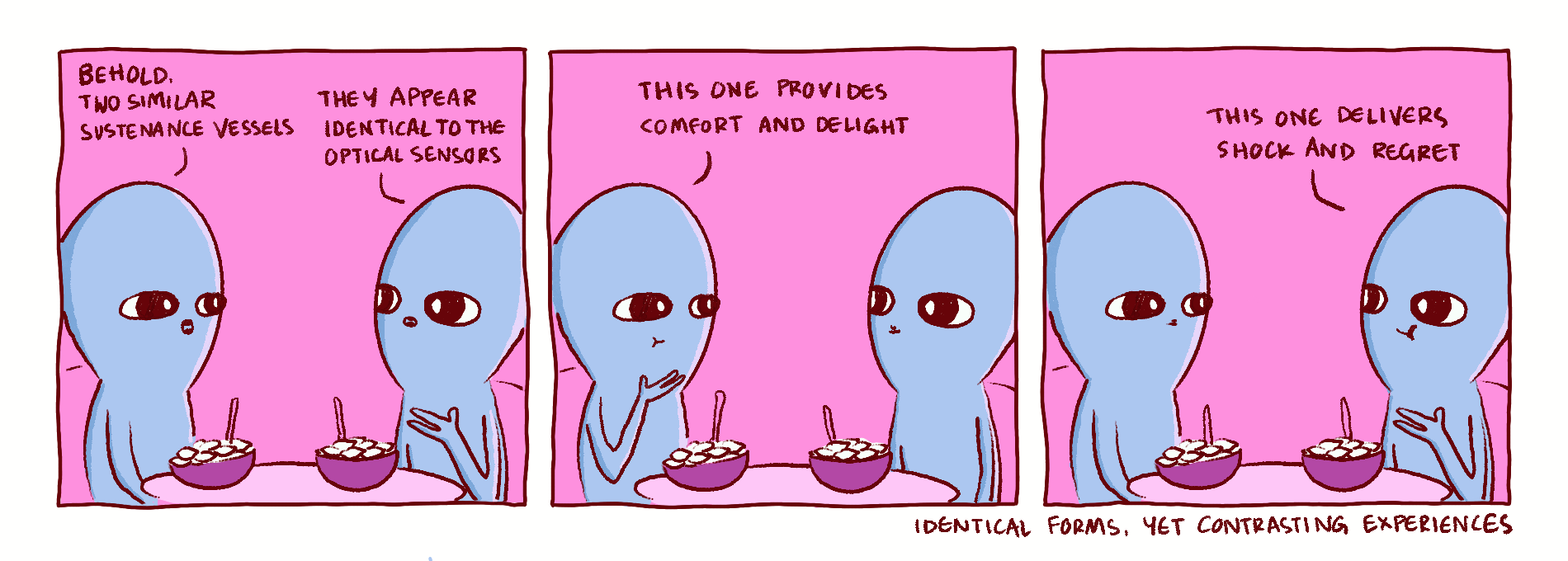
Special feature - Comics inspired by Strange planet comics by Nathan W Pyle.
Read, enjoy, and share your feedback or questions at jahnavi@plumhq.com.
Once upon a time
The need for Super Top Up (STU) as a product was identified much before Plum celebrated its first anniversary.
It was a result of a ton of user feedback that highlighted the problem of insufficient Group Medical Covers (GMC) that typically range from 2 to 5 lakh rupees, rarely reaching 10 lakh rupees.
Our first STU policy was sold on July 7, 2020, and it quickly became popular, especially with the "Increase your health cover by Rs.20 L" banner. The product witnessed a steady increase in the purchases till June, 2023, until we launched the V2 of our STU user experience.
The new experience that replaced the V1 didn’t do much with boosting our sales, in fact, it aided in bringing our sales to a stagnation point.
But, as Ruthiran rightly points out – “Pushing sales was never our sole success metric for STU redesign.”
So, here we are presenting you the story of a product revamp where user experience and informed decision making were prioritised over numbers.
Chinese whispers
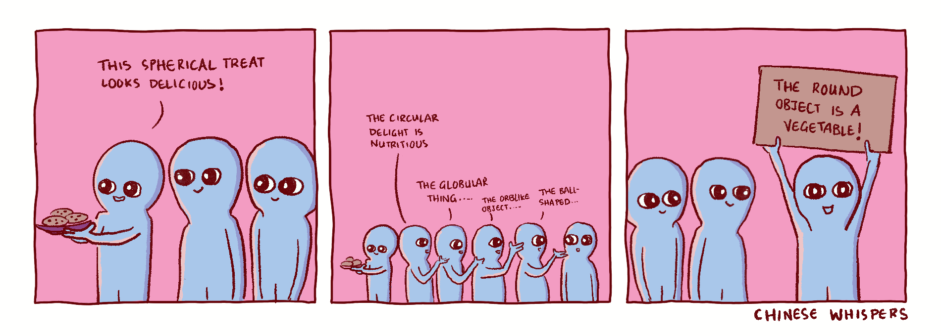
Several factors made STU an attractive purchase: enhanced coverage, the option to cover family members, its applicability regardless of job status, and most importantly, its affordability.
However, another key factor was the network effect at the workplace — essentially, "I bought it because my friend at work bought it."
Word-of-mouth is generally beneficial for any organisation. But, users relying on their colleagues to learn about STU coupled with a lack of proper education on the app/website led to unintended consequences – A high rate of claim rejections that left our users understandably agitated.
“As designers, our priority for the product is to build a smooth experience that disseminates all the information and clarity that’s needed.” says Ruthiran.
To understand the root cause we dived into exhaustive research packed with two surveys with close to 300 respondents and sixteen 1:1 interviews, followed by in-depth brainstorming sessions with internal stakeholders.
Understanding the 'Why?'
When we launched Super Top-Up (STU), we were confident in its benefits but underestimated the challenge of educating our users.
Our research identified three major bottlenecks in V1, and here’s how we tackled them with an effective redesign in V2.
No.1: STU is not just an add-on
The first misconception that users had was that STU works exactly like their existing coverage – “It is just an extension of my GMC cover.”
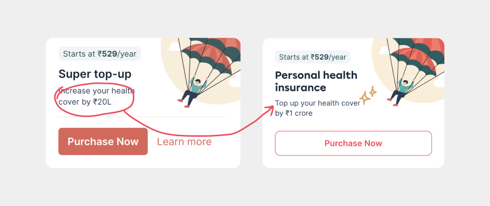
This confusion arose from an unintentionally misleading copy that stated, ‘Increase your health cover by Rs.20L’, which was often interpreted as ‘Turn your 5 lakhs cover into 25 lakhs’. However, the intended communication was, ‘Buy a top-up over your existing cover’.
"This reflects our failure to help users understand that STU is a completely different product from regular GMC," says Ruthiran.
Our goal is to empower users to make informed decisions without falling victim to unintended dark patterns. As a result, we started our redesign by first revising the copy on the banner.
No.2: Users looking past the PED clause
Like most health policies, STU includes a waiting period for pre-existing diseases (PEDs), making the policy unclaimable for a certain period. This has been a significant factor in claim rejections for users with PEDs.
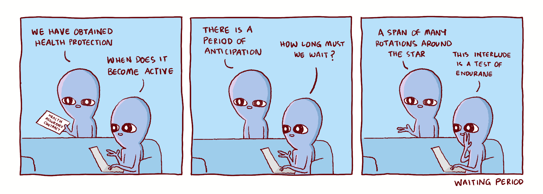
A closer look at our data revealed that most STUs were being purchased for older dependents, who are more likely to have pre-existing conditions. Recognising this, any product team’s initial response would be to consider disabling STU purchases for individuals with PEDs altogether. However, they set out to explore a more thoughtful approach through strategic design.
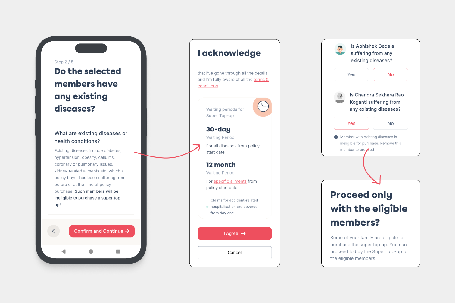
Ruthiran, who was involved in the decision-making process, reflected, “While we were onboard with the decision to restrict purchases for PED cases, we felt we had a responsibility to help our customers understand the reasoning behind it. And design could play a crucial role in achieving that.”
The following image reveals how we approached this design problem.
No.3: Educated but not overwhelmed
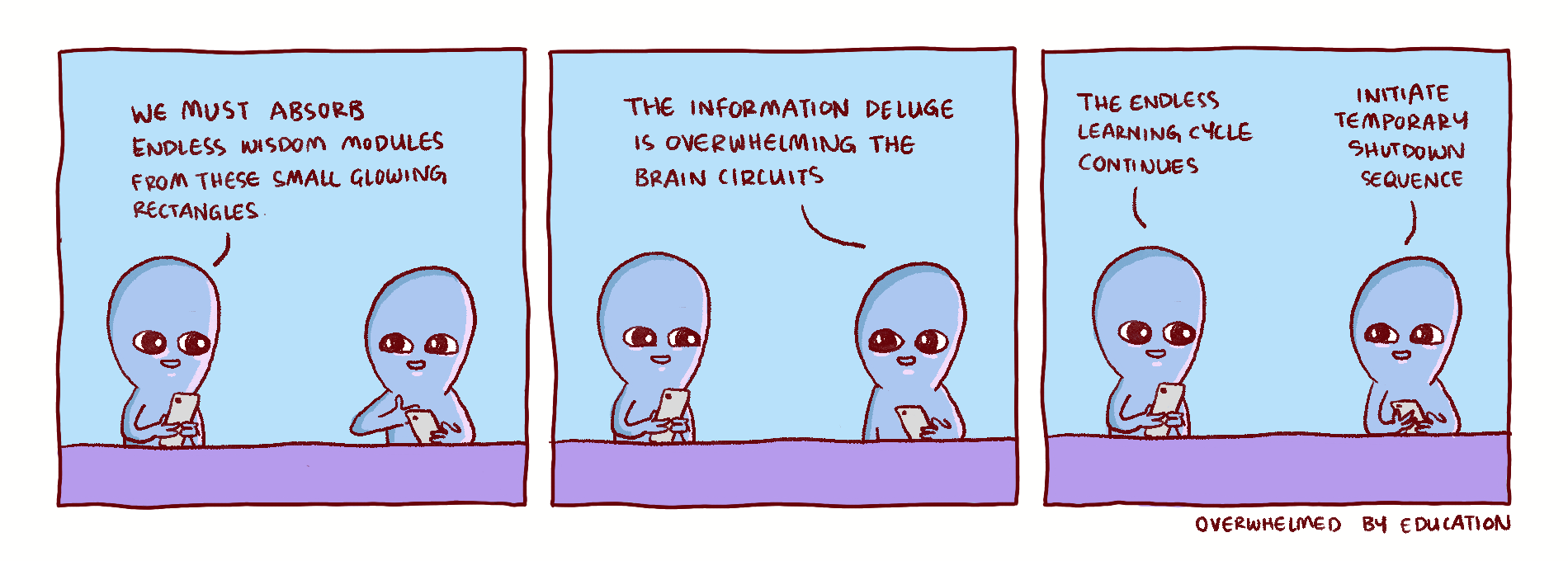
Overall, users struggled to understand how STU differed from their regular GMC and how the policy functioned overall.
“We recognized the gap in education, but we didn’t want to overwhelm users with too much information," says Ruthiran.
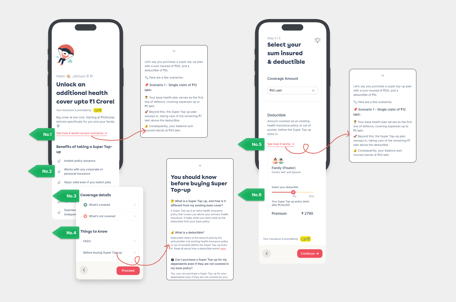
Drawing from research that identified several key touchpoints where education was lacking, the design team strategically introduced educational snippets throughout the user journey, ensuring our users were informed without feeling overwhelmed.
What’s next for STU?
“We’ve successfully refined the look and feel of the STU product journey, and now it’s time to strengthen and enhance the policy itself,” says Dhairya Thakker, the product manager dedicated to making STU a top choice for customers.
“While there are inherent limitations with a product like STU, we’re collaborating closely with our insurance partners to relax the waiting period clauses, ensuring it becomes even more desirable.”
Found these insights helpful? Stay tuned for more.
Until next time,
Jahnavi :)
Comments