

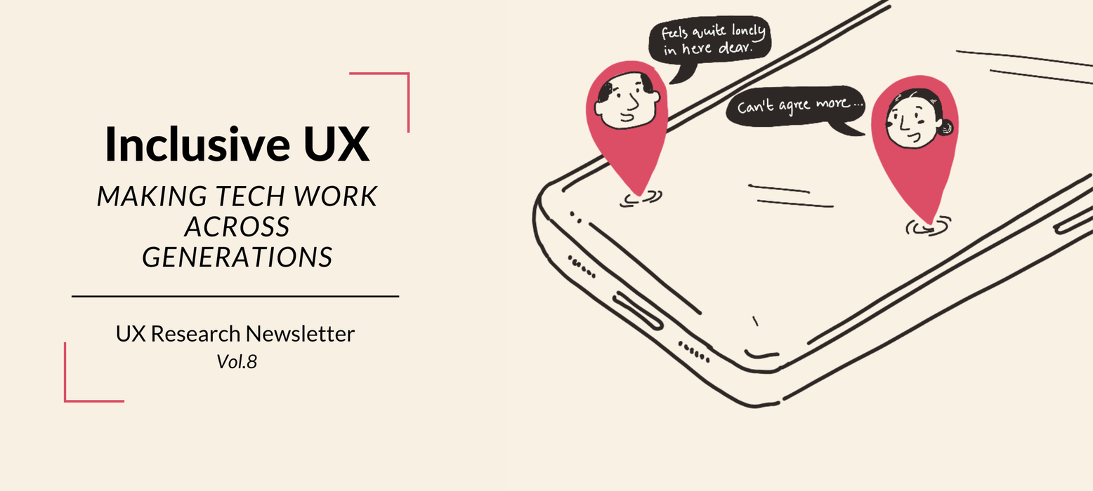
Hello Reader!
Sometime in the early 2010s, WhatsApp made its way into India, and by late 2014, my mom joined the digital world. She got her first smartphone only because my dad upgraded his—a hand-me-down Samsung Galaxy S3 with a 4.8-inch display and a touch response dulled by years of heavy use. But the real challenge wasn’t the device itself—it was everything inside it.
Until then, my mom had never needed a mobile phone. As a full-time homemaker, her world was within reach—neighbors dropping by for chai, long landline calls with family, and routines built around familiarity. But WhatsApp changed all that.
While Millennials embraced the shift toward digital interactions effortlessly, Baby Boomers and Gen X—my mom included—struggled. It took her nearly four months to get comfortable with the apps.
Back then, app screens were fewer, but the gap between knowing and not knowing felt vast. My mom, for instance, didn’t know which icon did what. She didn’t understand scrolling. The settings menu overwhelmed her.
Fast forward a decade, and that gap still lingers—only now, it looks a little different, with a whole new generation added to the mix: Gen Z.
Glossary: Who’s Who in the Digital Age? - At the end of this newsletter.
OK Boomer? Not Quite
At Plum, we’ve built seamless digital experiences for Millennials and Gen Z. But with the launch of our Dependent Login feature that allowed our users to invite their parents and in-laws to the app, we had to welcome a new user group—Gen X and Baby Boomers dependents(Born: 1946 to 1980), or as we’ll call them here, BoomeX Gen.
Unfortunately for us, we can’t just say, “OK Boomer!” and move on. We need to meet them where they are.
Before jumping into design and development, we took a step back to understand how well our current UX serves these users.
Bridging the Gap: What We Learned
Mobile UX has matured—design patterns are established, and iOS and Android experiences are more uniform than ever. But while technology has stabilized, people haven’t. Not everyone interacts with design in the same way.
Testing with BoomeX users made that clear—what felt effortless for some was unexpectedly tricky for others.
Here are a few key lessons from our research—insights that can help any startup make a Millennial- and Gen Z-friendly UX work for BoomeX too.
No.1: ‘Simple’ is Subjective
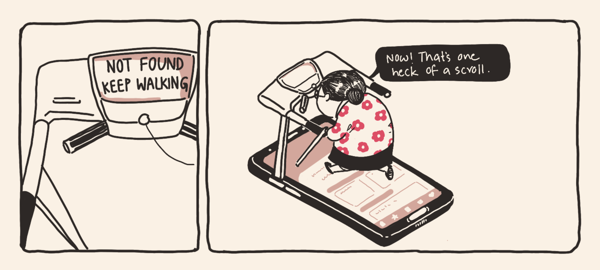
At Plum, we’ve always focused on keeping things clean and simple, relying on intuitive actions—tap, swipe, and scroll. But are these interactions as effortless as we assume?
For BoomeX, cognitive load is a real challenge. It’s not just about making actions simple—it’s about how they’re structured.
For example:
- A single tap is easy, but too many taps in succession cause fatigue.
- Similarly, excessive scrolling can pull users away from the actual context, making navigation overwhelming.
Since Plum is a one-stop destination for insurance, health, and wellness, users sometimes have to tap multiple times to complete critical actions or scroll extensively to find basic information. Recognizing this, we’ve started refining our designs to reduce unnecessary effort and ensure a smoother experience for all users.
No.2: Asking for Help Is Harder Than Offering It
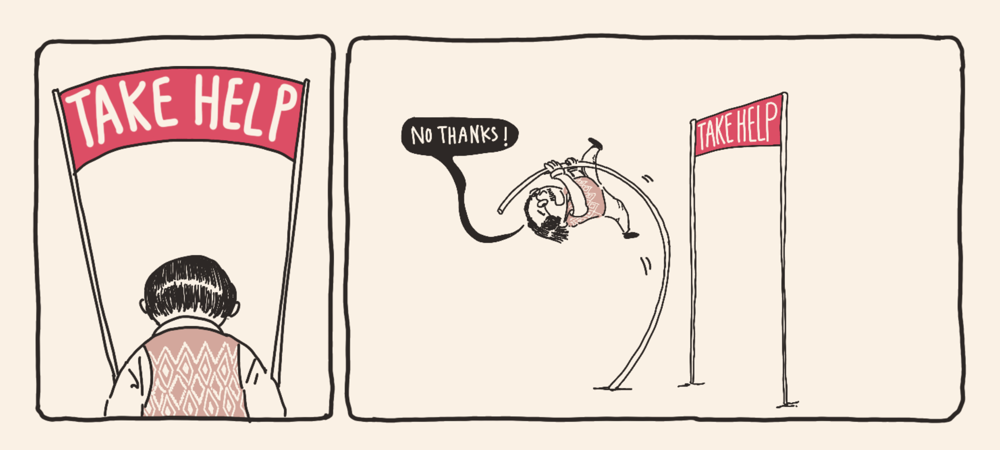
One of the key goals of our research was to understand how many actions BoomeX users could complete independently—without needing guidance.
What we discovered was striking:
A large portion of them rely on their children or caregivers for even the smallest tasks, like onboarding, selecting a doctor, booking an appointment, or joining a video call.
But our biggest insight? The reluctance to ask for help—or the frustration of relying on others—is a major reason why these users abandon the app. Many would rather give up than feel dependent. We realised that we need to build for independence by building familiarity and incorporating step-by -step cues.
No.3: Accommodating Caregiving
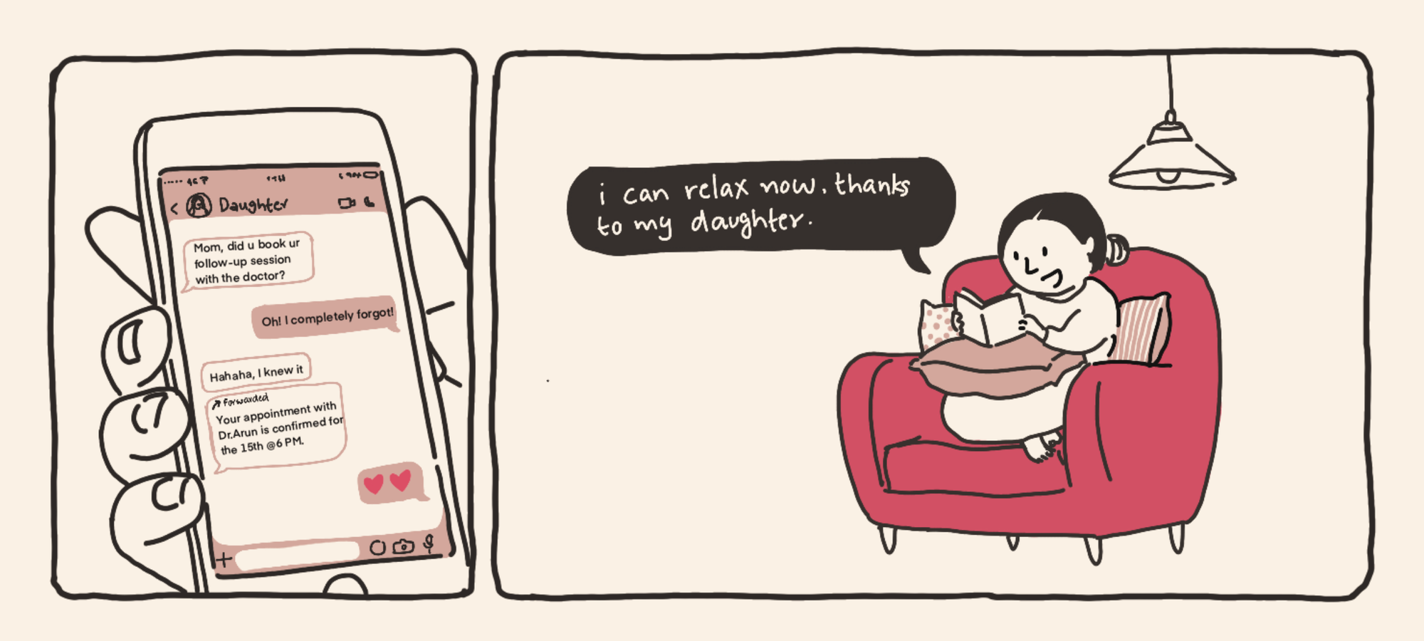
While full independence in using the app is the ideal goal, for many BoomeX users with low tech adoption, some level of dependence is inevitable.
When designing for this group, it’s essential to consider different caregiving scenarios:
- Living with their children and receiving direct care.
- Living apart and relying on indirect care.
- Receiving supervised indirect care, often through a relative, such as a sibling, acting as an intermediary.
Depending on the caregiving setup, the level of assisted app usage varies—sometimes subtly, sometimes significantly.
The key takeaway? Caregivers cannot be removed from the equation entirely. Instead of designing for complete independence, the user experience should acknowledge and support caregiving dynamics. One simple example? Allowing remote doctor appointment booking for parents—ensuring assistance without removing user agency.
No.4: The God in the Details
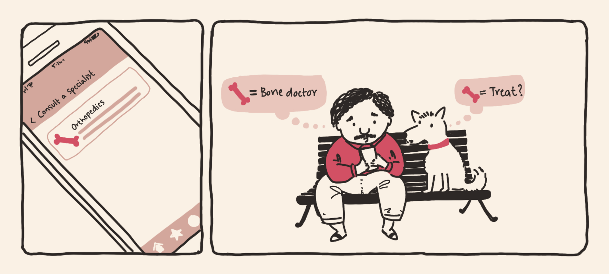
Digital iconography and UX copy are among the most impactful yet low-effort changes in UX design. When thoughtfully crafted, they can significantly enhance inclusivity and usability.
Boomers, in particular, prefer technology that is simple, clear, and easy to navigate—favoring intuitive UI designs that prioritize functionality over aesthetics. This preference extends to UX copy, making them gravitate towards larger fonts and high-contrast color schemes for better readability and accessibility.
For this audience, icons and text are taken at face value. Even a slightly ambiguous symbol can lead to misinterpretation of functionality. This is especially crucial for non-English-speaking users, where iconography and visual cues become essential.
A striking example? A user once booked an orthopedic appointment solely based on the bone icon next to the specialization—demonstrating the significant role visual design plays in user decision-making.
Designing for Inclusion Across Generations
At Plum, we believe great design goes beyond simplicity—it’s about creating digital experiences that feel effortless for everyone, regardless of their tech familiarity.
As we explore how to make our platform more inclusive, we see an opportunity to bridge the gap for users who often feel left behind in digital spaces. By focusing on intuitive interactions, proactive guidance, and thoughtful design choices, we aim to transform frustration into confidence—whether it’s reducing unnecessary taps, supporting caregiving dynamics, or making icons and text clearer.
This is just the beginning. As technology evolves, so do its users. Our goal is to evolve alongside them—building a future where navigating digital experiences feels natural, empowering, and truly inclusive for all.
Glossary: Who’s Who in the Digital Age?
📻 Baby Boomers (Born 1946–1964)
The last generation to grow up completely offline and the first to experience mass digital transformation as adults. They remember rotary phones, handwritten letters, and a time when "streaming" only applied to water. While many have embraced smartphones and social media, UX design isn't always built with them in mind. Think: the generation that still prefers calling over texting but now sends “Good Morning” WhatsApp forwards like clockwork.
💾 Gen X (Born 1965–1980)
The original multitaskers who grew up with landlines, floppy disks, and actual in-person socializing. They’re tech adopters, not digital natives—so while they’ve mastered email and Google, app-based navigation can still be a maze. Think: the generation that still double-taps the space bar for a period but isn’t sure what “swipe up” means.
📟 Gen Y / Millennials (Born 1981–1996)
The bridge generation—old enough to remember dial-up internet but young enough to have embraced smartphones like second nature. They pioneered the shift from desktop to mobile, from SMS to WhatsApp, and from asking “Can I Google this?” to just doing it. Think: the first generation to write “brb” in chat and then never actually be right back.
📱 Gen Z (Born 1997–2012)
The true digital natives—born into a world of touchscreens, instant gratification, and meme culture. They’ve never known a time without high-speed internet and instinctively double-tap anything that looks like it might be a Like button. Think: the generation that finds email “too formal” but can send 37 texts in under a minute.
Comments