
Hi, Gayatri here - today’s UX Research update is about something “deeply thrilling”: documents, bills, receipts, and the chaos they cause.
If you recall, we recently launched a new user flow to upload bills & receipts while filing a reimbursement claim. During our usability tests for this feature, we learned why testing early, even when things feel “mostly right,” can save us from shipping avoidable confusion.
A user journey with no reference point
Some flows are easy.
If you’re designing onboarding or checkout, users walk in with a mental model. Designers can borrow familiar patterns.
But this project? Not at all.
In the old flow, users uploaded all their bills and receipts and calculated the total claim amount themselves. Our teams then manually checked whether the bill and receipt amounts matched so users could receive the full amount they expected.
It “worked,” but only on paper. In reality:
- Frequent errors occurred on the user end since they weren’t thinking deeply about the documents they uploaded, resulting in a lot of back and forth.
- Our teams spent a lot of time manually reviewing and correcting these errors
To reduce this, the team proposed a brand-new flow:
- Step 1: User uploads all relevant bills & receipts
- Step 2: The app uses OCR to autofill amounts
- Step 3: The user has to review to check the amounts and whether the bill amount matches the receipt amount.
And unlike normal flows, this one had no existing mental model to lean on. It required users to:
- Learn something new (what are bills, what are receipts?)
- Do something critical (The final payout depends on document accuracy — the system picks the lower amount.)
- Understand OCR-generated totals
- Classify documents correctly
- Complete all of this with minimal cognitive load
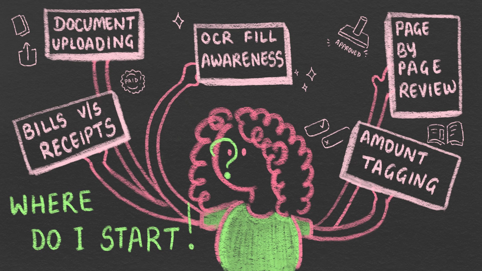
Basically, we were asking people to do accounting… on their phone… after a hospital visit.
So we knew conducting usability testing was non-negotiable.
No matter how good the designer, that’s a lot of jobs for one flow (refer to image above)
So we ran rapid usability testing in two rounds — four Plumbers each (we chose Plumbers since we were under tight deadlines) — before anything got locked in.
Examples of 2 moments that changed the flow
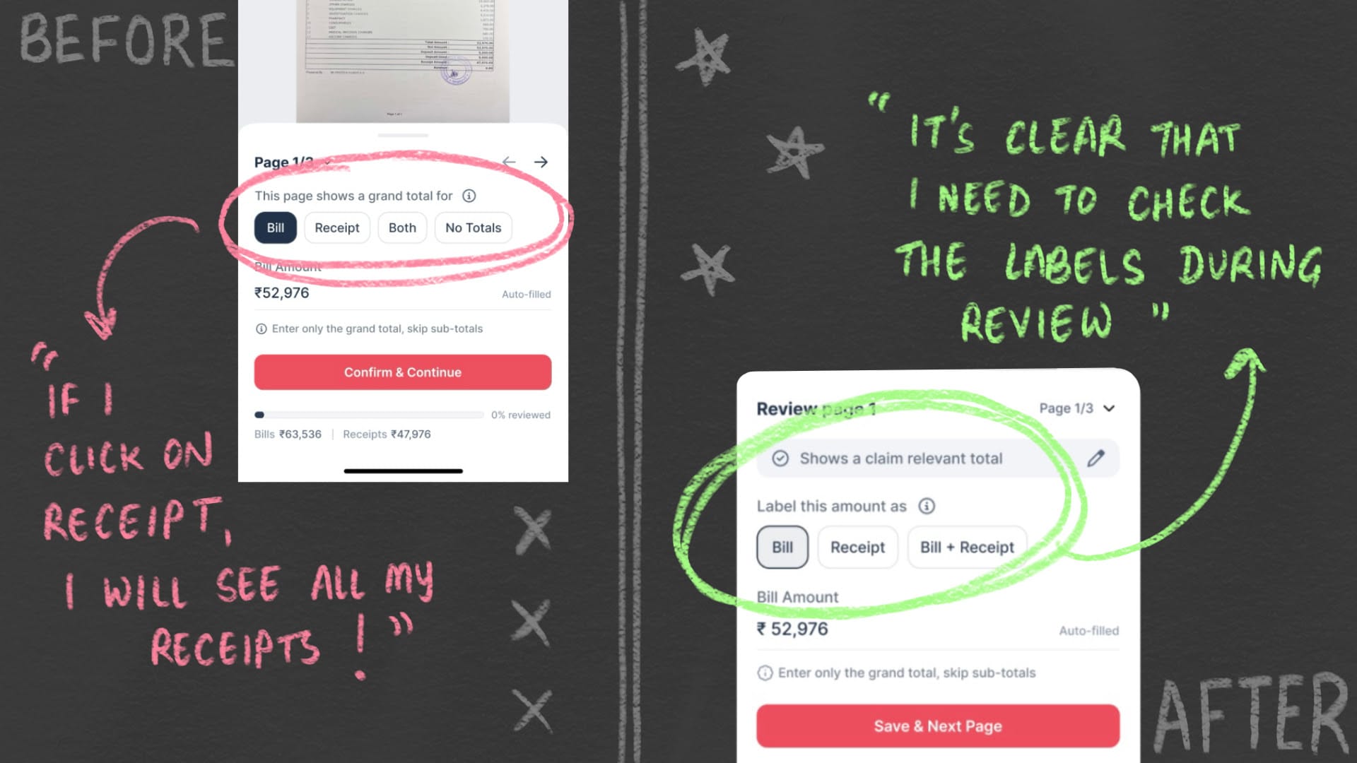
1. Chips were mistaken for navigation
Users saw the “Bill / Receipt / Both” chips and assumed they were navigation tabs; i.e., something you click to go somewhere.
This told us that the visual treatment was signalling the wrong behaviour. What we intended as tagging was being read as navigation.
The insight wasn’t just “users are confused.”
It was that familiar UI patterns come with strong expectations, and when we reuse them, users bring their own meaning with them.
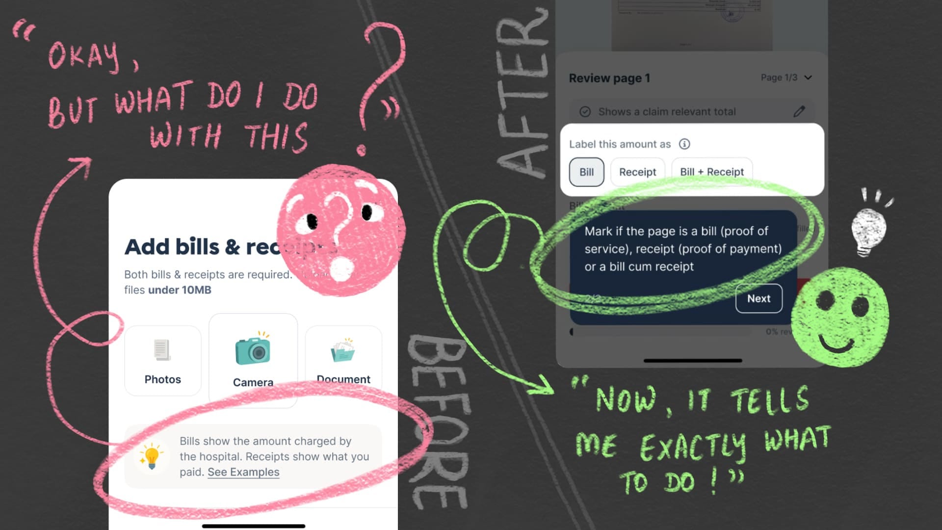
2. Education came too early to be useful
We explained the difference between a bill and a receipt at the start of the flow. On paper, that felt responsible.
In reality, by the time users had to apply that knowledge, it was gone.
This showed us that timing matters as much as clarity. Education only works when it appears at the moment of decision—not before, not after.
If this flow was left untested, these gaps would have quietly turned into wrong classifications, mismatched totals, and a flood of “Why isn’t my claim amount correct?” support tickets.
We fixed all such issues; tightened the copy, clarified tagging, moved education to where it was actually needed, and made the flow easier to complete.
As a result, our round 2 users were far more confident and well informed across their journey. 🙌
This project reminded us of a simple truth: Test early, fail safe. Especially when the design is unconventional.
Because when we test early:
- it’s cheap to fix,
- design team has bandwidth to change aspects of the design,
- and we pick up the tiny, human misunderstandings that would otherwise go undiscovered.
We genuinely love this process, even when it’s messy 🩷. And this isn’t just for product teams. Sometimes Sales wants to validate a pitch, or CX wants to understand confusion patterns, and research helps them too.
We’re here for all of it.
This bit of the project was a team effort: Subarna crafting the design, Jahnavi and I running the calls, and frantically typing observations while our fellow Plumbers tried to understand why they had to review amounts before submitting.
Until next time,
Gayatri 💛
Comments