
BTS of the research, design and ops efforts
During our marketing team’s research efforts for publishing the instantaneously successful ‘Corporate Health Report’, we discovered that only 30% of employees actively participate in their organisation’s healthcare initiatives including health camps. Now, naturally we needed to ask, ‘why?’
Responses ranged from:
- “They are boring!”
- “Half of the time I don’t even know when and where they happen”
- “I don’t need these camps.”
- “I am mostly held up in back-to-back meetings”
So, we decided not to stay calm and go that extra mile to turn health camps into desirable experiences. This article captures our journey that ensued, starting with a research study led by the UXR team(Baishnabi Monger and myself) and the product and ops efforts to design and organise the successful ‘Plum Health Mela’. It also attempts to capture the challenges of designing a physical experience such as a camp for a team that is predominately digital focused.
The beginning (D-14)
It all started when our Co-founder and CTO Saurabh Arora and our Director (Healthcare) Jayanth Ganapathy put forth an unusual research request. The document titled ‘Reimagining health camps’ had its objective spelled out loud and clear - ‘To enhance employee engagement and customer interaction by offering health and wellness camps within office premises’, not to mention the emphasis on being able to provide a ‘curated’ experience that will ‘wow!’ the users.
The traditional idea of health camps is definitely not anywhere close to the extracts of the brief as mentioned above. One is reminded of boring hallway set-ups with representatives awkwardly nudging employees to take part in a camp that is largely perceived as a distraction during work. How do we solve for this?
Physical survey (D-10)
Health camps have been an integral part of corporate wellness initiatives from the very beginning. Then why was engagement never properly solved for? As employees who share a similar emotion towards health camps as the majority of the workforce , we decided to crack the puzzle.
To begin with, instead of sending out lengthy online surveys that have an average response rate of 1% on a good day which might also be highly biased we decided to do something unusual - a physical survey. We designed a mock-camp experience with different zones - fitness, screening, ageing, counselling and relaxation, and had users navigate through each one of them as we swiftly noted down observations and collected feedback. We encouraged the users to walk us through their imagined experiences while taking us through their expectations and potential constraints at every step.
Users left their footprint in the zones and activities they would like to take part in (we gave them a tiny footprint stamp to make this happen).
Few questions that acted as our north star are-
- How might we ensure maximum participation?
- What could be the key motivating factors for the user?
- How might we design a delightful/ WOW experience?
- How might we ensure a smooth experience without any wait time?
- What would be the preferred format - step-by-step vs free navigation?
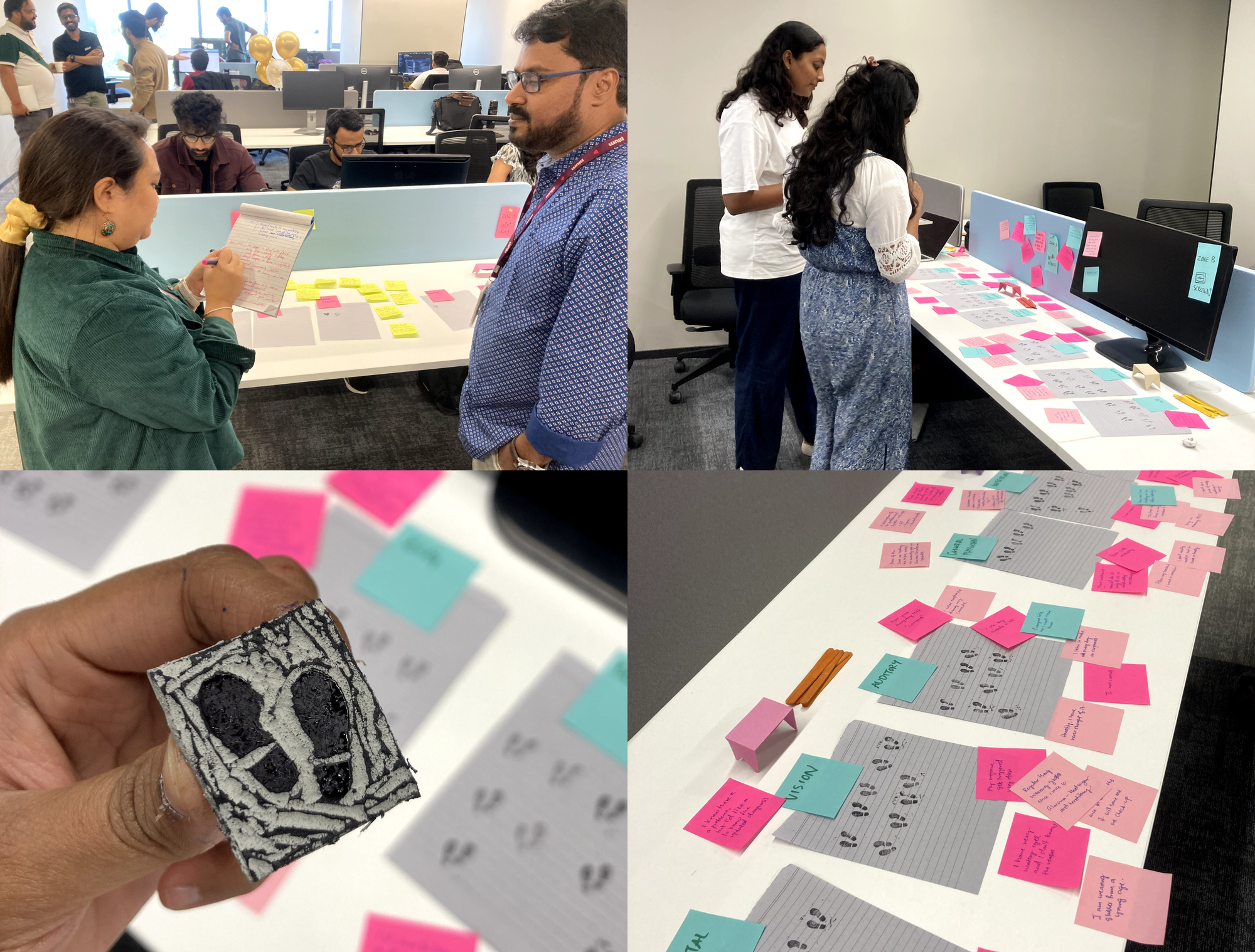
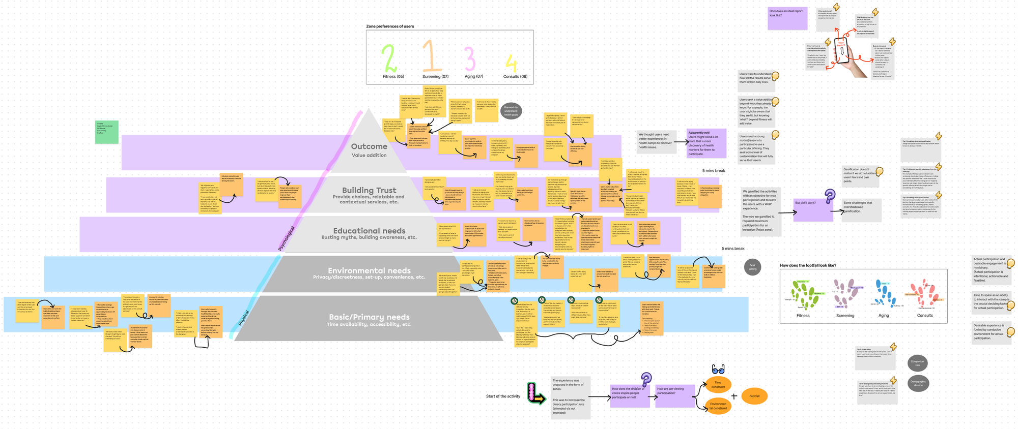
Key takeaways (D-7)
With 18 participants volunteering for the experience, we were able to draw a wealth of insights. We found ourselves taking the user-centric approach and understanding user needs(both physical and emotional) by laying them down according to Maslow’s hierarchy of needs. We mapped the insights based on their affinity, examined certain assumptions and hypotheses that we started with, explored the ideas of gamification and incentives, all while taking into account the quantitative data at the same time.
Collaborative workspace on Figjam that helped us brainstorm on the design
Some key insights that served as stepping stones for our design ideation are as follows:
- Time and timing problem - Interference with work is a no-no for users - robust designing considering time to spare, time slots (time of the day/week) and waiting time is key.
- User’s (especially female users) perception of comfort and privacy are directly linked to their willingness to participate.
- Users are apprehensive about in-office set-up - they need to be assured that their data will be dealt with extreme care.
- Perceived value-add - Let them know how is this camp better than their current personal choices of health and wellness?
- Bring attention to relatable issues - for example, typical workplace constraints like sedentary lifestyle, work-life balance, back pain, eye strain, etc.
- Instant gratification - Users love it when results are instant and accurate.
We also want to deliver enhanced value-add to the HR/People-success team, and we realised that they seek comprehensive reports that will elevate their internal reporting.
Brainstorming and design (D-4)
Once the insights are in, the next steps follow at a lightning fast pace. We got the team together for an elaborate workshop to brainstorm on potential ideas. Keeping in mind the constraints involved and the insights derived the team managed to come up with potential ideas to enhance the camp experience. We agreed on some ideas instantaneously while some took a few more rounds of deliberation. Some of the ideas include;
- Discreet and comfortable spaces for female users to freely participate.
- Designing robust health data entry systems to avoid data leaks and ensure accurate reporting.
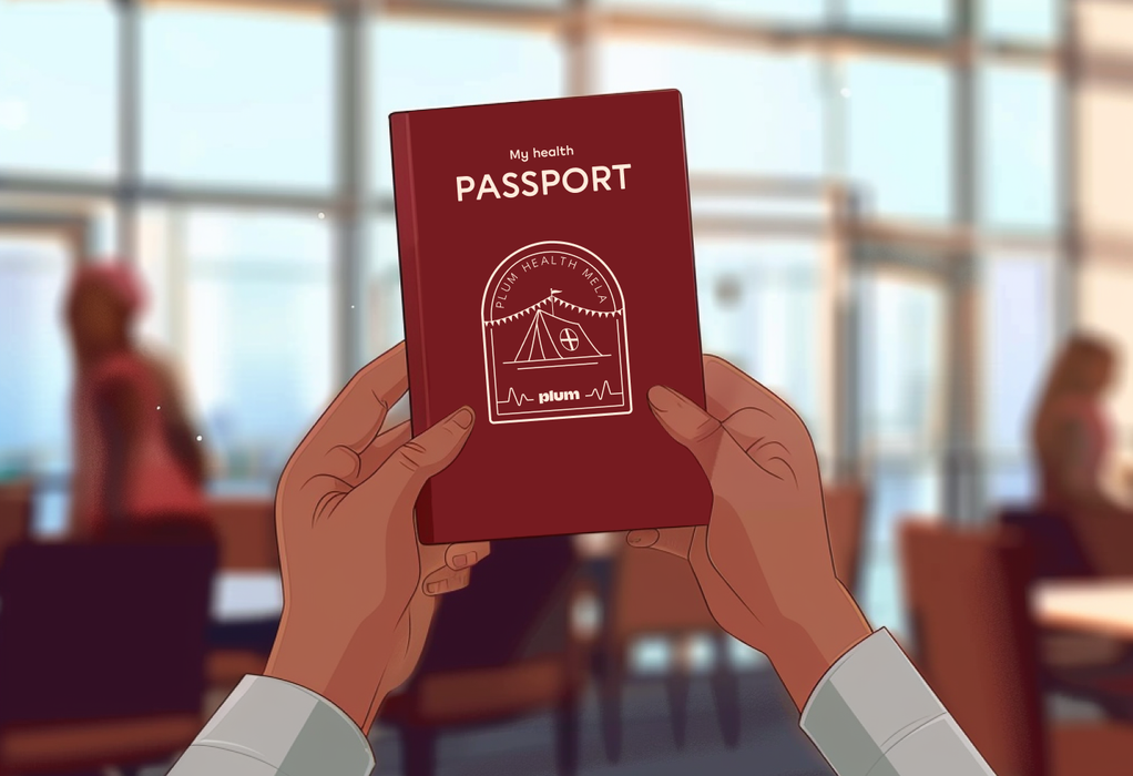
- Well designed check-in and check-out experiences using visual props like a health passport that will reinforce user motivation to start and finish the journey.
We quickly listed down the actionable, drew up plans and assigned tasks. It was nerve wracking for sure, but nothing could beat that adrenaline rush.
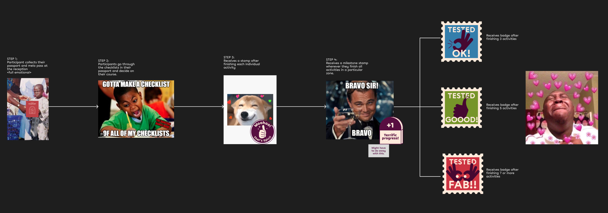
Adding some fun to our experience flow brainstorming exercise with memes
Setting things in motion (D-2)
The wellness team led by Jayanth was quick at getting the perfect health and wellness partners on board - HealthifyMe for our fitness and body screening zone, Apollo health for testing blood sugar and blood pressure in the screening zone, Dr.Agarwal’s for vision check-up, Clove Dental as our dental partner and finally Rofl.fit to offer the much sought after massage experience.
PMM and product teams overseen by our Director(product) Ashish Khandelwal quickly worked on setting the backend systems in place. This included -
- Enabling a new benefit under the health benefits section on the Plum App to ensure online registrations.
- Implementing a quick Health-Risk Assessment survey in the registration flow.
- Designing data-entry forms for each zone to enable diligent and swift data entry.
- Design and integration of comprehensive health reports that each user received on their emails on the very same day.
The UX Research team went an extra mile to design the health passports and the cumulative health reports while Sunil MB, our office manager and ops ninja ensured that the collaterals got printed on time.
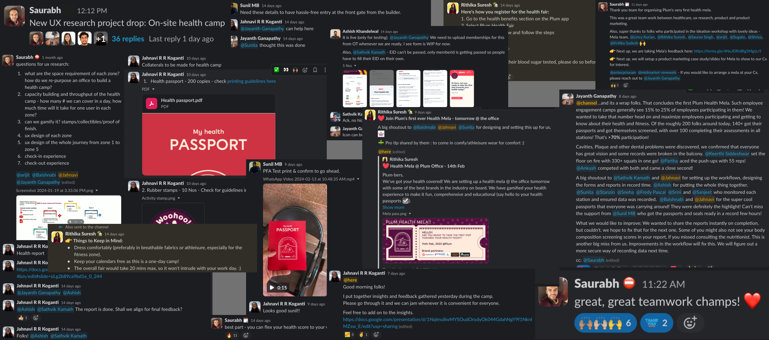
A snapshot of over 1000 slack exchanges that made everything happen
The day of the camp (D-0)
With the extent of thought, planning and care that went into curating each user interaction the day of the camp seemed far from chaotic. Though not perfect, we managed to amass an impressive 70% participation rate which assured us that we are on the right track to designing the ideal experience. With a little more tinkering around we are more than confident that we can curate the best camp experience for our customer organisations and their employees.
The health camp was a resounding success, but we are resolved to take the participation all the way to 100%. To achieve this we set-up rigorous feedback mechanisms on the day of the camp at almost every touch point. We identified all the stakeholders involved (Vendor partners & users; check-in, data-entry & ops teams; Telehealth, wellness, UXR, Product & PMM teams) and made detailed observations around everyone’s experience.
Some learnings from the feedback gathered:
- Accurate data entry is always a challenge. We need designated personnel trained to take care of this at every such touch point.
- Wait time equals boredom - we need to eliminate bottlenecks that result in wait times.
- Check-out experience needs to be designed with equal care as the check-in experience to not make it seem like a loose-end.
For a team with a heavy digital front and a minimal experience curating physical experiences we needed to be doubly sure that the experience is adequate and flawless. And the only way of testing this is by executing it amidst real-life constraints. Now, a little over two weeks after the successful execution, we are swiftly working on the feedback and plugging all the gaps to ensure that a wholesome user experience is in place as we truly believe...
Good experience is the one that sticks!
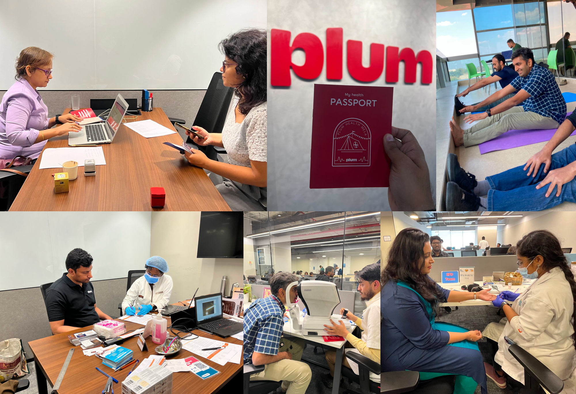
Glimpses of users experiencing the Plum health mela
Comments